Overview
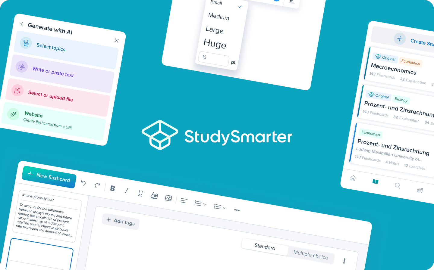
As the lead designer for StudySmarter flashcard feature, I spearheaded a crucial redesign project to transform our editor experience. Our users were struggling with a cluttered, distracting interface that hampered their learning content creation. This case study details how we turned a pain point into an opportunity, resulting in a 47% increase in user engagement and a 92% satisfaction rate with the new design.
The Challenge
Our existing flashcard editor faced several critical issues:
😫 Users reported feeling overwhelmed by too many options
🔄 The workflow was inefficient, requiring unnecessary clicks
👀 Visual noise distracted users from content creation
⏱️ Card creation took longer than necessary


